Here is the commentary that my group and I did over our horror trailer. In this commentary we discuss the different scenes and how we made them:
Possession trailer feedback
Posted in Uncategorized on January 26, 2013 by elizaobHere is a video showing people’s feedback about my trailer.
Evaluation
Posted in Uncategorized on January 19, 2013 by elizaobJade Carter, Jamie Denny and I made the horror trailer ‘Possession’ for our A2 media project. Our horror trailer is about a girl who after finding an old book at the library with strange symbols in it becomes possessed by a demon. This is because the book acted as a gateway into this realm for the demon. Making the trailer has not only allowed me to develop my editing and filming skills but has also allowed me to research in depth what is needed to create an amazing horror trailer.
In terms of cinematography my trailer develops on forms and conventions of real horror trailers. When my group and I started our research we analysed many horror trailers, the ones that stood out to us were: Paranormal activity 4 (2012), Sinister (2012), The Devil inside (2012) and Scream 4 (2011)
(Sinister trailer)
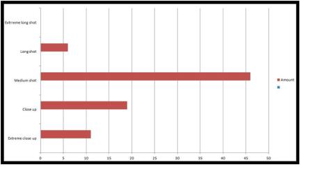
By analysing different horror trailers we were able to find out the different shots that a horror trailer used. We found out that the majority of shots were: Mid shots, Close ups and long shots. Close ups or extreme close ups were used to enable the audience to see a characters reaction or to get a shot of the weapon or a significant object in the film. After realising this we filmed many close ups for our trailer for instance, at the start of our trailer we used a close up of the book and the symbol inside the book as they are both significant props in the trailer.
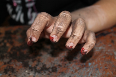
Additionally, later on in the trailer we have a close up of a hand leaving a trail of blood on the wall, our intention for this scene in our trailer was to leave the viewer repulsed and horrified. The idea for this scene came about after watching ‘Ringu’ (1998) and seeing the hand of Sadako that had cracked and broken nails with blood and residue of dirt on it after clawing at the walls of the well for days when trying to escape.

The hand from Ringu
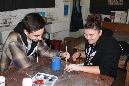
After watching the movie I had the image of that same hand hitting a wall and slowly scratching our symbol away. After telling my group this we agreed that when filming this scene it would be imperative for us to use a white wall to make sure that the red on the hand of our actress stood out. Before filming the scene we used an hour to paint the hand with red and white paint and then we rubbed dirt into the hand to make it look repulsive. When filming the scene we had to make sure that there was an equal amount of lighting on both the hand and the wall to make sure that the contrasts in the colours were visible. Unfortunately, we weren’t able to get the symbol onto the wall so we decided that the hand should leave a trail of blood on the wall instead.
Filming this scene taught us how much time it takes to film one scene since it took us nearly two hours to film that scene and about an hour to plan it and find a location. Moreover, when filming this scene we had to learn how to deal with setbacks and how to change ideas quickly since we weren’t able to film the hand clawing away at the symbol.
Towards the end of the trailer we have many close ups of our actress to convey her change in character and to show the fear in her face. For example, we have a close up of her repeatedly writing “you are not unique” on a paper to show her change in character. This scene was influenced by a part in ‘The shining’ (1980) when Jack repeatedly types “All work and no play makes Jack a dull boy”.

“All work and no play…” from The Shining
To contrast the use of close ups we use long shots and mid shots. For instance, at the start of the trailer we used a long shot which slowly dollys into the Library to show that this is an important location in the film. Sinister uses this same kind of shot at the beginning of the trailer to show that the house is an important location in the film.

The book shop that we filmed in
In terms of editing my trailer develops on forms and conventions of real horror trailers. When my group and I analysed the Scream 4 trailer before filming our own trailer we realised that at certain points in a horror trailer the cuts became quicker due to fast paced editing to create tension and shock the audience.
(Scream 4 trailer)
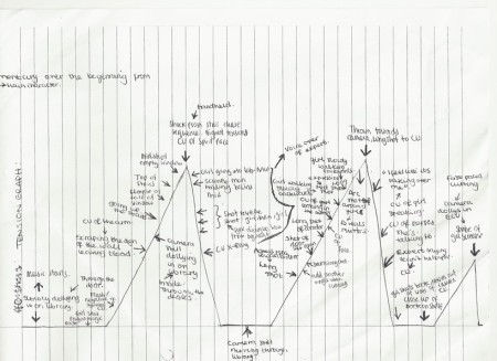
For example, towards the end of a trailer the cuts become faster and at the very end of the trailer there is an unexpected shot of the antagonist to give the audience one last shock. After discovering this we decided to create a tension graph with our shots for our trailer on it based on the different levels of tension in an actual horror trailer.
(Click to enlarge)
This tension graph helped us when editing since it enabled us to know when to use fast cuts and fast paced editing.
Our horror trailer is based on the sub-genres of demonic possession and the supernatural, because of this I believe that our trailer doesn’t challenge forms and conventions of actual horror trailers. I think this because our trailer is similar to films such as: Paranormal Activity (2007), The Exorcist (1973) and The Devil Inside (2012). Moreover, the handheld footage that is in my trailer is similar to the style that Paranormal Activity and The Devil Inside are filmed. Furthermore, when deciding the characters in our trailer my group and I thought that we definitely had to have a Final Girl seeing as most horror movies have them. As Carol J. Clover said our Final Girl is the “first to sense danger” this is seen in the middle of the trailer when she begins to realise that the demon is following her.

Sidney Prescott-Final Girl from “Scream”
Additionally, when deciding how much of our antagonist to include in our trailer after a suggestion from our teacher we realised that the less of our antagonist we included the better. This is because if the viewer sees our antagonist regularly they won’t be scary to them, this is the case in many horror movies. For instance, in the ‘Saw’ franchise “Billy” the puppet is meant to be scary since he describes sadistic traps to “Jigsaw’s” victims. However, since the viewer sees”Billy” all the time that element of fear has gone and he has turned into a joke.
(Clip from Scary movie 4- A good example of “Billy” being turned into a joke)
The music used for my horror trailer develops on forms and conventions of real horror trailers. Usually, horror trailers use strings, mainly violins, which eventually create a crescendo at the climax of the trailer to heighten tension. Similarly, my horror trailer uses strings, mainly violins, cellos and also cymbals towards the end which eventually creates a crescendo that creates the same effect as real horror trailers. Not only does this heighten tension and create fear it also creates shock once the music abruptly stops and the face of the ghost appears on the screen.
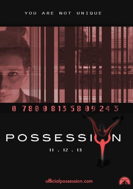
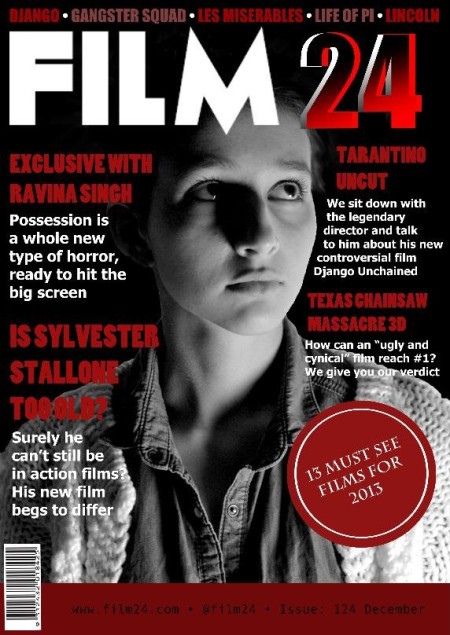
When our group was creating the ancillary texts we decided that they should have some things in common for example: colour, model and tagline. This was so that they could all interrelate and be recognisable to our audience.
When we were planning our poster we decided to make it simple like the film posters that are around today. For instance, the Paranormal Activity 4 (2012) and Scream 4 (2011) posters were the posters that helped us generate ideas for our own poster due the simplicity used to make them. The Scream 4 poster for example is especially simple with the use of just one photograph of “Ghostface” and only a few words. The simplicity makes the poster seem eerie and makes Ghostface appear even scarier. This then gives a good impression of the movie and makes it seem as if it will be terrifying.

Scream 4 poster
In contrast to this, we knew that it was important for us to make sure that our film poster didn’t look crowded and a bit messy like old film posters. For example, the ‘Cat People'(1942) film poster:

cat people poster
The poster has many words and pictures which makes it look messy, confusing and not professional. This then makes it appear as if the film would be bad which was the opposite of what we wanted our audience to think.
When making our poster we decided to use red like we did with our magazine cover and throughout parts of our trailer so that our film was easily recognisable to the viewer. To make the picture that we used for our poster red we used the ‘Hue and Saturation’ tool on photoshop . Moreover, we used red since it is a common colour used within the horror genre since it has the connotations of blood and danger which is a major theme throughout all horror movies.
We decided to use white for the title of the film on our poster because it stands out really well against the black and red. When creating our symbol we used the ‘Smudge’ tool to smudge the corners and the middle of the ‘O’ in order for it to not only resemble the symbol in our trailer but to make it look more professional. This is because before deciding on using the smudge tool to create the symbol we created the same symbol that we had in our trailer using the brush tool. However, we decided not to use it since it didn’t look very professional and looked as if a child had drawn it.
When making our poster we decided to merge the image of a barcode, a still of CCTV footage used in the trailer and the image of our model because they play on different fears that we have in society today. For example, the image of the CCTV footage plays on the fear that we are constantly being watched since CCTV is nearly everywhere in the United Kingdom today. Furthermore, the idea of always being watched links with our plot since our protagonist is always being watched and followed by the demon in the trailer. Moreover, we thought that as a group it was important for us to play on fears in society since when researching horror movies we found out that most successful horror movies did this.
We thought that it was important that our tagline “You are not unique” appeared in the trailer and on the poster so that all our product interrelated. Furthermore, we built upon this phrase on the poster with the use of a barcode to further emphasise the idea. This combination would make our film more recognisable to our audience since “You are not unique” would become a tagline that our audience would recognise.
When making our magazine we again decided to use red, black and white to create continuity between our poster, magazine and trailer. We decided that our image should be black and white in order for it stand out and to attract people. Moreover, we picked this specific picture because we thought that it was a good mid shot of our actress and it resembled head shots that actors use. Therefore, we thought that this image linked with the words ‘Exclusive with Ravina Singh’ that appear on the magazine cover since the photo gives the impression that the reader will be reading about the actress and not the character in the film.
While editing the trailer I knew that getting feedback from my teachers and peers was important in order to improve my trailer. For instance, while editing the trailer my teacher told our group that the middle of the trailer did not fit well with the rest of the trailer. After receiving this feedback my group and I filmed another scene of our actress writing symbols down on a paper. While editing the footage we split up the stairs scene by adding this scene in to make it more interesting. Similarly, another teacher told us that from this scene onwards we should make the cuts faster in order to speed up the trailer to make it more exciting and create more tension. Receiving this feedback made our trailer much better since we used fast cuts to create more tension as seen in other horror trailers.
After completing the horror trailer I knew that it was important to get audience feedback in order to find out what worked well and what could be improved. I created a survey on Survey monkey and asked the following questions:
- What do you think worked well in the trailer?
Most people said that they liked the music, make-up, editing and the build up of tension in the trailer. Additionally, I asked a media student from another Sixth Form the same question and they said: “The editing and effects were good. Intertextual references from films I have seen were good. They reminded me of ‘The Ring’ because of the use of symbols”. I am happy with this feedback as I feel these are the strong points of the trailer. The Intertextual reference surprised me since The Ring didn’t influence our symbol but rather the hand used in our trailer. However, since we did study ‘Ringu’ and ‘Sinister’ our ideas for a symbol throughout the trailer probably did come from both films. This is because even though ‘Sinister’ didn’t use symbols in the film it was part of the plot that the protagonist sees the image of the demon everywhere much like our protagonist seeing the symbol everywhere after seeing it once. Ringu could have influenced the symbol because in the video that Reiko discovers there are many clips of rings which could have influenced our symbol.
- What could be improved?
Most people either said the plot could be clearer or that the end should be scarier. Conversely, one person interestingly said that we should change the way the trailer is put together by reversing the whole thing. Most of the feedback I have received for this question makes sense as I know that the plot is quite complex it could have been made clearer in the trailer.
- Would you watch the film?
75% of the people said that they would watch the film. This means that we have made a good trailer since we have attracted an audience that would watch the film.
Overall, I do think that the feedback I received while making the trailer and after have helped me a lot and I now understand what worked well and what did not.
Throughout this whole project I used technology during the planning, construction and evaluation stages. Firstly, for the editing stage of the project we were provided with Mac computers with programmes such as: iMovie, Adobe Photoshop and Adobe Indesign. These programmes were quite easy to use however, we did have quite a few problems with these programmes especially iMovie. This is because if we uploaded footage with sound on it and then inserted music into iMovie it would automatically change the volume of the music throughout the trailer so that the sound on the footage could be heard. This would have been very useful if it did that for only that particular section. However, it didn’t so this was very frustrating because that was not what we wanted and it was a constant problem throughout the editing of the trailer. Conversely, iMovie allowed us to use colour correction easily and effectively. For instance, we decided that we should colour correct the clips with our demon in so that they had a hint of red in them. This is because the colour red has the connotations of danger and we knew that using this colour in certain clips would create a sense of fear. With that being said, overall iMovie was a good programme to use as it was quite easy to understand.

iMovie logo
During the research and planning stage of the project I used the website Word press to present my research. Word press was easy and helped me display my research in a clear and concise way also, I was able to embed videos from YouTube and insert images into my blog posts on the website which made my blog posts more interesting. My group and I used http://www.Guardian.co.uk to read reviews about recent horror movies throughout the planning stage so that we knew what types of plots and shots worked well in horror movies. Additionally, we used YouTube to study trailers in order for us to understand what types of shots and cuts we needed to make a good horror trailer.

youtube logo
When making the trailer we used a Nikon DSLR because it could film in 1080p HD which allowed our trailer look more professional. Moreover, we used a lightweight tripod to record our trailer so that we could film steady images.
Lastly, when getting audience feedback I used Survey Monkey to make a survey which was easy for my audience and I to use.
Overall, this project has allowed me to develop many skills such as filming and editing. Moreover, I have learnt how important it is to plan since good planning was the reason why this project was so successful. This is because as a group we were able to organise ourselves efficiently and we were also able to have enough time to deal with setbacks.
Opinions
Posted in Uncategorized on January 4, 2013 by elizaobHere are people’s opinions about my horror trailer-
Person 1-
“From 00:42-1:00 it’s really good. The story line isn’t very clear for me its a little confusing. I can tell from the book that something bad happens but there’s no explanation towards what the book symbolises in the story. After the Paramount sign it shows how the girls changed but we don’t know what she used to be like. Also, for the other girl I don’t know what she’s there for but I know she’s a bad character. Overall I think it has a lot of potential but it would help if the story was clearer.Also, it would have been cool if you had edited everything backwards so that at the end it showed that it started from the book.”
Person 2-
“The whole idea was pretty cool. The camera angle at the beginning added a kind of eerie feel. I can’t think of many negatives but maybe add some screams or something to appeal to the ears more. It’s so ridiculously good though”
Person 3-
“I really liked it. The choice of music was good and really fit in well with the video. The only thing I would maybe suggest is the bit where she “changes” – maybe the video could have been black and white or had some other colour change in the trailer to reflect that. Otherwise, very good.”
Person 4-
“Really good. It scared me especially, when the face came up. However, I think the actress needs to be more dramatic that bit should make you jump because it’s unexpected but, I wasn’t really terrified that’s about it.”
Person 5-
” Professional. Good transitions. Reminds me of ‘Attack the block'”
(Attack the block trailer)
Person 6-
” The editing was good. The effects were good. Intertextual references from films I have seen were good. It reminded me of ‘The Ring’.”
(The Ring trailer)
Horror Trailer
Posted in Uncategorized on January 3, 2013 by elizaobHere is the horror trailer that my group and I made:
Editing the last scene
Posted in Uncategorized on December 19, 2012 by elizaobMaking the decision about what clip should be at the end was hard since we wanted a clip that will stay in the viewers mind. The first clip we ended it on was a close up of the spirit. However,we thought that if we saw her face too much during the trailer it would make her seem less scary.
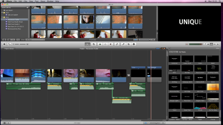
We then decided that we should end it on the last word of our tagline “You are not unique”. But, after getting some feedback from our peers we realised that ending it on the word “unique” was confusing since they thought that the name of our film was “You are not unique” rather than ‘Possession’ also, most of them couldn’t make a link between the different words since they were on different clips.
In the end we decided to end the trailer with the close up of the spirit. To make her look scarier we changed the colour of the clip to a slight red, we did this by colour correcting the clip using the advanced tools on iMovie. We added a red tint to the clip because it has the connotations of danger, given that she was the antagonist we thought that this colour would be appropriate. Lastly, we made the clip shorter so that it could be more shocking.
